
Regional Schematic
Summary
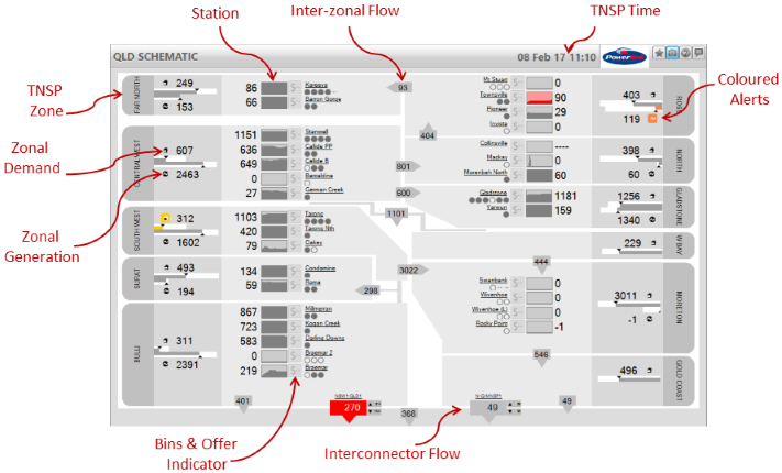
The Regional Schematic shows the details of the selected Region, including generation, interconnector flows, constraints, TNSP zonal demand, and TNSP flows.
Image
Description
The Regional Schematic shows the details of the selected Region, including generation by station, interconnector flows and limits, constraints, aggregate zonal generation, and, where available, TNSP inter-zonal flows, and TNSP aggregate zonal demand.
You can choose which region you view by using the Region Selector at the top left hand corner of the schematic.
TNSP Zones
The screen is divided into zones that are defined by the TNSP for the region - in general these zones match those published by the TNSP in its annual report. The TNSP zones are represented by the grey panels, and in the schematic for Queensland shown above, are labeled "Far North", "Central West", "South West", "Bulli", etc.
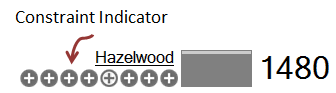
For each zone that has generation, ez2view displays the total Zonal Generation as labelled in the image above. The Zonal Generation is the sum of the metered generation of all the units in the zone and it is updated every dispatch interval. The white bar above the Zonal Generation figure represents the theoretical maximum generation in the zone, which is calculated as the sum of the registered capacities of all the generating units in the zone. The grey portion of that bar represents the current generation as a proportion of the theoretical maximum.
Zonal Demand is provided by the TNSP for the Region, and is therefore available for those Regions for which you have subscribed to the TNSP Data feed (see below). ez2view displays the total Zonal Demand as labelled in the image above. The Zonal Demand is updated every dispatch interval. The white bar below the Zonal Demand figure represents a historically high demand figure (the maximum demand from the 2009-2010 financial year, which may not be the historical all time maximum for the zone). The grey portion of that bar represents the current demand as a proportion of the historical high point.
Inter-Zonal Flows are available for those Regions for which you have TNSP data (see below). The inter-zonal flows provide aggregated line flow data for power flow between the zones, and these figures are updated every dispatch interval. The TNSP Time that appears in the top right hand corner of the screen shows the time at which the data on the screen was read by the TNSP. Note that the TNSP Time and the current dispatch interval may be different due to the different schedules by which the TNSP's take readings.
TNSP Data
Zonal demand and intra-zonal flows are available for Queensland (Powerlink), NSW (Transgrid), and South Australia (ElectraNet). You can subscribe to each of these data sets separately. If these data sets are not visible on your screen then the most likely explanation is that your ez2view licence does not include a subscription to the TNSP data. Please contact us if you would like to arrange to purchase a subscription to one or more of the TNSP data sets.
Stations
Stations are placed on the screen within their TNSP zones using the following icons:
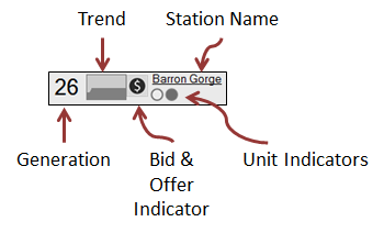
The icons have the following meaning:
- Station Name
- The display name used by ez2view for the station. Clicking on this name navigates you to the Station Entity Browser that shows more data for the station.
- Generation
- An instantaneous reading of the output of the station at the beginning of the current dispatch interval.
- Trend
- A chart showing generation as a proportion of the total registered capacity of the units that make up the station. By default this chart looks back 2 hours. (If you would like to change this value, please contact global-roam support for instructions).
- Unit Indicators
- A unit indicator is used to represent each unit within each station. If the unit indicator is hollow, then the unit is off; if the unit indicator is filled in then the unit is running (producing at least 1 MW); if the unit indicator is showing "--", then ez2view has no generation data for that unit for the current dispatch interval.
- Bid & Offer Indicator
- A Bid & Offer indicator is used to represent a significant change when bid and offer data is available. Hovering over the indicator opens a window allowing you to see what changed in the bid.
- The indicator has 3 states:
- Dark $ indicates a change
- Grey $ indicates there has been no change in bid data from the previous dispatch interval for any of the station's units
- $-- indicates no bid data is available.
- "(L)" is used as a suffix on the name of the unit to indicate a Load.
- Loads are represented as being drawn down from the top of the trend chart (as opposed to generation which draws up from the bottom).
- Load values will appear as negative numbers.
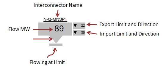
- Interconnector Name
- The display name used by ez2view for the interconnector. Clicking on this name navigates you to the Interconnector Entity Browser which shows more data for the interconnector.
- Flow MW
- The flow (in MW) on the interconnector for the current dispatch interval.
- Flow Direction
- Indicator pointing in the direction of flow for the current dispatch interval.
- Flowing At Limit
- When the flow on the interconnector is at a limit, the interconnector icon is decorated with a bar across the end of the direction indicator; for the purposes of this decoration, the limits are measured using whole numbers so an interconnector that is flowing at a fractional number of MW below its limit will be shown as flowing at the limit.
- Export and Import Limits and Direction
- The limits on the interconnector are shown, together with the direction of the limit. Note that these limits can both be in the same direction depending on the constraints currently invoked to control the interconnector flow.
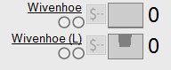
Loads
Loads are displayed using the same conventions as for Stations except that:
The image below shows how the Wivenhoe pumps are represented as a load.
Interconnectors
Constraints
Whenever a unit or an interconnector appear on the left hand side of a bound constraint equation, the icons for the unit or interconnector are modified to include a constraint indicator, as shown below.
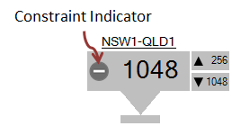
The presence of a constraint indicator signifies that the unit or interconnector is on the left hand side of a bound constraint equation. The sign indicates the sign of the factor for the unit or interconnector in the equation. A unit with a positive factor will cause the constraint to bind more tightly if it generates more, while a unit with a negative factor will cause the constraint to free up if it generates more. Similarly, if there is a positive term on the interconnector, an increased flow will bind the constraint more tightly, and decreased flow will cause the constraint to free up. If the constraint indicator contains both a positive and negative sign ("+/-") then the unit or interconnector is appearing in more than one constraint equation during the current dispatch interval.
If you click on the station or interconnector name, then you will navigate to the entity browser, where you will be able to see which constraints are affecting the unit or interconnector (see below).
Color Highlighting
The Regional Schematics use colour to highlight changing data values, as explained on this page. The changes for the TNSP data points are measured between each update that ez2view receives from the TNSP.
Navigation
Where there are changes to a unit's bid (dark $), you can click the icon and view the changes via the Show Bid Details link.
The names of Stations and Interconnectors are linked to the Entity Browser for that type of object.