
Bid Stack Time Series Chart
Summary
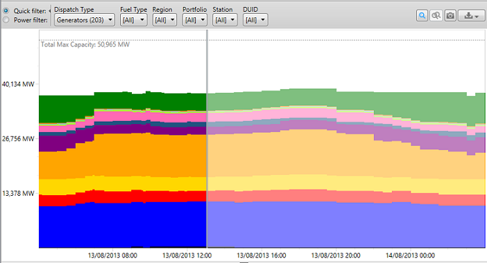
The Bid Stack Time Series Chart shows bid stacks as they have evolved over time. The offered volume is aggregated into colour coded price ranges, and then stacked to show the distribution of megawatts in each price range for each dispatch or trading interval.
The Bid Stack Time Series Chart is part of the Bids and Offers tab.
Image
Description
The Bid Stack Time Series Chart shows bid stacks as they have evolved over time. The offered volume is aggregated into price buckets, colour coded by price, and then stacked to show the distribution of megawatts in each price bucket for each dispatch or trading interval. The body of the chart shows...
- Time along the x-axis
- Volume along the y-axis
- Price ranges (or "buckets") represented by colour
Applying Filters to the Charts
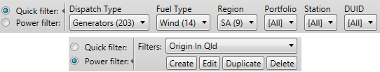
You can filter which units are included in the chart using either Quick Filters, or Power Filters. See this description of DUID filters for more information.
Chart Annotations

The grey vertical line on the body of the chart indicates ez2view's current dispatch interval. All data before this line has been dispatched (in 5 minute intervals), while the greyed out data after this line is yet to be dispatched (in 30 minute intervals).
If you hover your mouse over the chart you will see a blue vertical bar and two hover panels, one above the graph, and one below. The bottom hover panel shows the interval that is under the cursor (this is Sun 12/05/2013 12:30 in the figure above) . The top hover panel shows:
- The price range under the cursor, and several of the surrounding ranges
- The volumes in each of the price ranges
- The cumulative volume at the top of each range
Moving the cursor up and down the chart causes the price range display in the hover panel to scroll to bring the range under the cursor into view.
The dotted line at the top of the chart indicates the sum of the Maximum Registered Capacity values for the DUIDs that are included in the chart. This shows you the theoretical maximum capacity that could be offered by the units on the chart, while the uppermost point on the coloured portion of the chart indicates the aggregate Availability of all the units on the chart.
Using the chart
This chart can be used to trigger aggregate details and comparisons:
-
Click on the chart and
 to view all the bids and offers at the selected interval
-
Click to select the BASE interval and Ctrl+Click to select the COMPARISON interval.
 allows you to compare all the bids and offers between the two periods selected on the chart.
Click here for more information on bid details.
Export to CSV
You can export the data in the chart to a CSV file. You can either export the data as:
- Raw Data, in which case the file will contain, for each dispatch interval, ten rows for each of the selected units. This file could become quite large if you have a large number of units and/or a large number of days selected.
- Bucketed Data, in which case there will be, for each dispatch interval, one row for each price bucket.