
Merit Order Chart
Summary
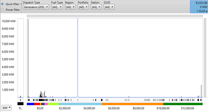
The Merit Order Chart shows the distribution of price bands for the currently selected dispatch interval, with price along the x-axis, and the volume offered at each price band shown on the y-axis.
The Merit Order Chart is part of the Bids and Offers screen.
Image
Description
The Merit Order Chart shows the distribution of price bands for the currently selected dispatch interval, with price along the x-axis, and the volume offered at each price band shown on the y-axis. The chart highlights where, within the range of prices, volume is being offered, and where there are gaps (i.e. no volume offered) within the price range.
The leftmost portion of the chart (marked "FL") shows volume offered as Fixed Load for the dispatch interval. To the right of this, the chart shows how much volume has been offered at each price point.
At the bottom of the chart, along the x-axis, runs a colour coded strip that indicates the correspondence between price buckets and specific prices. If you click on a coloured segment of the strip the chart will zoom into that part of the x-axis covered by your selected price bucket.
Above the price bucket line, there is another strip that includes a marker at each offered price band from the aggregated bids and offers on the chart. This strip includes a marker for every price band, including those with zero volume offered in the current dispatch interval.
You can use the control marked "RRP" at the bottom left of the chart to add regional dispatch prices as annotations on the chart.
If you hover your cursor over the chart, the cross-hairs will focus on the nearest price band with volume, and the blue panel at the top right of the chart will show the price, the total volume offered at that price, and the number of units offering volume at that price. If you click the triangle in the bottom right of that panel then you will see the details of the units and the volumes they have offered.
Applying Filters to the Charts
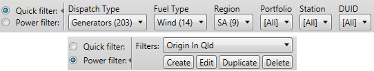
You can filter which units are included in the chart using either Quick Filters, or Power Filters. See this description of DUID filters for more information.
Controlling Your View
You can control the horizontal and vertical zoom of the chart to highlight different segments of the price range, and you can scroll through the chart when it is zoomed in. You can use any of the following methods to control your view of the Merit Order Chart:
- You can click on a price bucket colour on the strip below the chart; this will zoom the chart to that price range.
- Above the chart is a horizontal strip that allows you to zoom the chart by clicking the end of the bar and dragging it to change it's length until the chart covers the area you are interested in. You can also drag the slider like a scroll bar to scroll the chart to the area you are interested in.
- You can place your mouse over the chart and use your mouse wheel to control the horizontal zoom (that is, you can control how much of the x-axis range is visible). Rolling the wheel towards you will zoom out (increase the visible range on the x-axis), and away from you will zoom in. While zooming, the chart will stay centered on the point under your mouse cursor.
- You can click the chart and drag horizontally; this will move the view of the chart along the x-axis.
- You can click the chart and drag vertically; this will zoom the chart in or out on the y-axis only.